This "feels" like minimalism to me, but I'm honestly not sure. The strong lines in the background could be minimalistic, I guess.
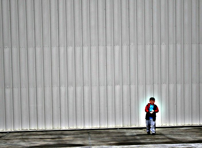
Anyway, I thought this was kind of a neat effect (not the halo -- that was an experiment). My son is around four feet tall. He is standing in front of an airplane hangar, so it makes him look itty bitty.
You met your goal of showing his small size compared to the hangar. The halo is OK, but I think it would work better if it didn't have blue/green around it.
Well, certainly a study in perspective and size. I might like the halo better had it been extended to his feet. Then he would be appearing as though through some kind of portal from another world (and you could use it for the paranormal challenge:>) Just kidding.
I like this! the image is really cool, i like the play of the smudges from the floor against the sharp panels in the hangar. your boy sets it all off nicely and gives it an anchor of soft & warm life
Heh - I was wondering what the heck you guys kept in your garage if it was that big! I very much like the scale here - little guy, BIG door. Not real sure about the halo, though.
I think you have done well and you have placed him in a good location within the image. The halo draws attention to him even more. Make it kind of magical. Well done.
I really like the bold colours and the high contrast on the boy compared with the sparse background.
I'm not fond of the halo though. I think it separates him from the background slightly taking away from the sense hes lost in it or dwarfed by it. But it doesn't stop this being an interesting shot.
I too like the minimalism and the overall grungy background, but do not care for the halo around the boy. I do like the bold colors of the boys clothing and the contrast throughout.
i love the grungy background and your little boy against it ... its a contrast .. also his colouring so intense is another great contrast .. i personally dont like the halo, but we're here to experiment and no-one's gonna give you a crappy vote .. YAY !!! ..
Not sure I like the halo. It looks like you did some selective desaturation also -- maybe not. The background is interesting -- perhaps a better example of negative space than minimalism. I also like the tilt. And the textures and shadows on the ground really help to anchor it.
I'm seeing a trend in some of your entries, whereby the subject is often placed in the lower right. Maybe you don't realize it, or maybe that's exactly what you meant to do. Just an observation. In any case, I'm enjoying seeing what you come up with each day. And overall I do like this shot.







 Add photograph to your favorites
 Add photographer to your favorites


 Photographer found comment helpful.


