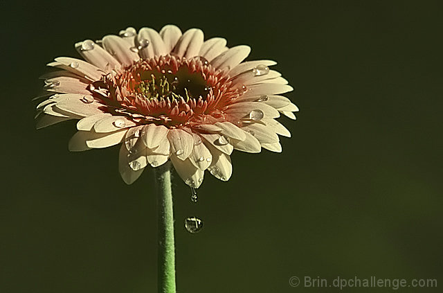
The warm pinks did not come across as much as they needed to here. Though the subject is meant to be a warm color, the predominant shade is green. Still, it's a nice image. I like the drop sliding off the leaf.
Great shot, beautiful flower, composition, everything! The funny thing is, the colours appeared to be a bit dull to me, but I didn't think this photographer would have settled for dull colours, so I tried opening it up in photoshop, and alas, it appeared much more clear and vibrant. I have more to learn about this, but I think it has something to do with colour spaces. Bottom line, I am not penalizing for the colour appearance, but you might want to keep that in mind in case others see the same phenomenon (perhaps it is only my computer??). Off to do research!









 Add photograph to your favorites
 Add photographer to your favorites


 Photographer found comment helpful.


