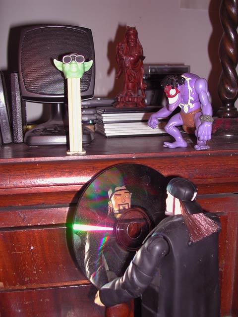
I love the idea used at the bottom of the photo - the toy holding the CD and using it as a mirror. I don't like the rest of the image and feel it just detracts. I'd like to see this done with a plain background, perhaps cream cloth or something, with the lower right subject matter as the whole thing. Kavey
I really like the subject and the "reflection" came as a fun shock. Love the expression on his face which I don't think would be as noticible in a straight on shot.
Meets the Challenge: Yes Artistic Merit (Would I print/frame/hang it?): 1 Creativity (Did a lot of thought go into this photo?): 4 Technical (Focus/DOF/Lighting/Etc): 4 Composition (Subject well-positioned and framed): 5 WOW Factor (Is the photo interesting?): 3
It might have been more effective to concentrate on the disk and the figure. For me, the items above and so much of the furniture showing distracts. Closer cropping or a closer shot might help with this.
Nice effort, but the strong, harsh light from the right side cast strong hard shadows, glared off spots i don't think you wanted hi-highted, and washed out all detail from the pez despensor. Also, it looks like the focus of your shot was the reflection in the CD... Why include all the other stuff? Do you feel the speaker added to the shot? If not, it shouldn't be there... The same goes for each object there... Practice makes perfect :) Keep on shooting!
I really like the idea and creativity of the CD and guy in the foreground. I feel that the dresser top detracts rather than adds to him though. So does the glare on the dresser. Did you try to crop down to just have him in the shot? DPz






 Add photograph to your favorites
 Add photographer to your favorites


