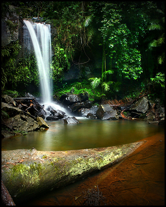
My wife gave me a weekend day off from the family (thanks honey!), so I went for my first bushwalk in a couple of years now. I had a great trek around Mt Tambourine and down to Curtis falls. Spent an hour clambouring over slippery wet rocks looking for different vantage points on the falls, and in the end, the best view was from the observation platform. :) I had another shot of the rainforest that I like better than this waterfall, but it was a 3-shot panorama, so I can't enter it.
Editing is mostly lots of manual dodge, burn and multiply. Also a little selective colour and saturation, minor cloning, blurred overlay and Luko sharpening. I definitely sold my soul to the DPC voters here in an attempt to goin a better score. Personally, I would prefer to leave more detail in the shadows, but I decided to go all out for score here. I wonder if it will work. :)
Scores have been all over the place lately, but my predicted score for this is over 6.5. Dream score over 7.1.
Statistics
Place: 52 out of 500 Avg (all users): 6.3904 Avg (commenters): 8.5000 Avg (participants): 6.3208 Avg (non-participants): 6.5750 Views since voting: 1343 Views during voting: 235 Votes: 146 Comments: 9 Favorites: 2 (view)
For one the orange color in the water, the green of the leaves and the white of the falls all really compliment each other very well. I like the use of the 1.3s shutter speed as it makes the falls seem like there's more water AND the pool is smooth without any ripples. It must not have been too windy down in where you were shooting because the leaves don't show any motion for a 1+ second shutter.
Sorry I don't have too much of a critique on what to improve. Overall it's a perfect photo, now all you need to do is insert a little "wow factor" (I'm not yet sure how) to push you over a 7+ score. Great photo. -BB
This was a 6 for me. I really like the water and the green. The reflection on the water is great too. I think the log is very distracting to me, as well as the very bottom of the photo. My biggest problem is that there's nothing to really capture my attention, nothing that really stands out. It's just a pretty picture of a waterfall.
I really like this photo and I gave it a 9 in voting. I like the sharpness and I do like the bright greens unlike karmat.
The brown water does stand out quite a bit compared to the rest of the photo but when my eye is drawn there by the color I like that I can see the details under the water. There is more to explore there and I find that interesting.
I really, really like the composition in this one. It isn't as straightforward as a "textbook" example, but it is still well-balanced and allows the eyes to wander around in the frame, and feels complete.
To me, the bright, bright greens are a bit off-putting. Everything looks so calm and subdued, except for the greens -- especially in the center of the frame. If that is what you were going for, it works. I know dpc seems to like the super-saturated green look (I call it drAchoo green), but it is kinda off-putting to me.
The other thing I noticed, and it may be just me, is that some of the rocks around the base of the fall looks a bit pixelated/over-sharpened/out of focus. It is not bad, but it is noticeable, and since our eyes tend to rest at the base of the falls, it may have made some of the voters feel that it was a touch out of focus.
It's not the log that bothers me (although it does pull focus), it's the brown stuff under the water to the right of it. It almost seems to be a shot of it's own added on to the waterfall shot.
What if you sliced this down the center (or just to the right of center - maybe including all or part of that central fern?) and then cropped a bit off the bottom?
This may sound odd, but I think in this particular FS you may have been hurt a bit by the fact it's a landscape of sorts - note that there were no landscapes in the top ten this time. Who knows why. Still, a top 10% finish in a free study of 500 entries is pretty darn good - score may not have been where you'd have liked it, but the placement is very good. You've handled the composition well - feels quite balanced to me - and have done a good job with the light, both in exposure and processing. I'm wondering if a crop to take out part of the foreground log would lessen its presence - it's a very strong element in the shot - but I'm not sure what that would do to the overall balance. Besides, I like the growth on it. And I do not see this as overprocessed - the processing seems to be well-handled without overdoing it.





 Add photograph to your favorites
 Add photographer to your favorites

 Photographer found comment helpful.


