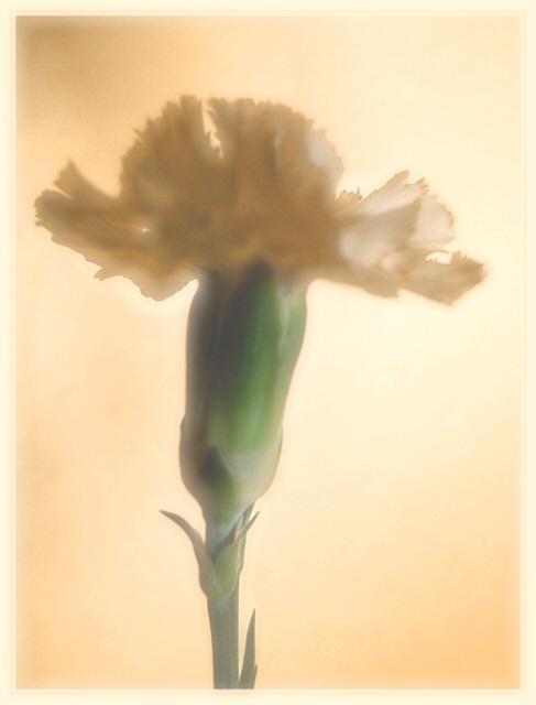
This shot was a orange Carnation! I just stuck it in soft focus and sharpened it a bit! I would like to hear some more ways I could have made it better! I for one would not give a one! My lowest was probably 3 on photos! Except for bad photos I give ones!
Unless my monitor is way off (which I'm sure it's not) this is no where near orange, other than the colour cast which arguably could have an orange hue. Compositionally it is OK but I think more negative space on either side would have been better; enough at the top; nicely off-center. Focus seems a little soft but that could be the preception due to the colour cast/hazy effect. This could probably be removed for the most part with Levels and unsharp mask. 2
I hate to be one of those voters, but it's not orange... and the image is too stylized (soft focused and over processed) for me to count it as a winner...sorry.
Soft focus has always been something that I didn't prefer, so take this for what it is worth: a sharper focus on the flower would have helped a lot. That having been said, I really like the background color choice with this.





 Add photograph to your favorites
 Add photographer to your favorites


 Photographer found comment helpful.


