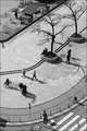
The problem with a shopping mall that's built in a circle is you never quite know where you are or where you're going. This is the Lillien Carre mall (assume accent on the last "e" please) next to the train station.
I shot LOTS of options for this challenge. Lots. I shall put some in my portfolio or something. When reviewing all my options, I kept in mind these very salient points from Yanko (whom I've mentioned more than once in these challenge missives, but I'm betting he doesn't know - don't tell him):
Challenge relevancy: I really do think that this has curves in it (based on the circular structure of the building, for one thing) and I really do think they make up a good bit of the composition. Now Yanko does say you really shouldn't do the obvious, and architecture may be on that list, but at least I didn't do paper curls, which if you DO do paper curls, you gotta do 'em really well and I can't get that "really well" part on set up shots just yet.
Good technicals: Hmmm... I did overcontrast (maybe) but probably didn't sharpen enough. I never sharpen enough. Some detail is probably lost. So not all that great on technicals, but they are fair. And I spent an hour (almost literally) cloning out a very small fine guide wire to prevent it from being a distraction. Can I get a bonus .01 point for that?
Intent: Here we could have an issue. I was shooting wide on the wide angle (10mm) and the perspective is a bit skewed. Not sure if that will be seen as intentional, but the straight up version (different frame) is kinda dull. Take my word for it.
Wow factor: Zip. Nada. Lost all possible points in this category.
In the other tips, the first is that "full color is better than b/w in most cases." The color wasn't all that exciting here, but I'm also quite sure that going b/w puts me on a lower footing to start with. Ah well. Second is that every detail counts. See above about removing guide wire. I still want points for that. No offensive subject (unless you have a fear of malls), no real meaning other than the architect of this particular structure did a good job - I like the sorta highway markings on the floor. And then there's the "Keep things simple" advice. I promise, I will try to learn to take that advice some day. Really, I will. Try. Can't guarantee I'll succeed.
So given all of the above, I expect a 5.0 for meeting the challenge. Damn well better meet the challenge - there are CURVES here, people! :-) Anything above or below that is anyone's guess, but I'm betting it ain't gonna be a barn burner. Hopefully it won't crash and burn either.
You still reading this, Michelle?
Statistics
Place: 66 out of 206 Avg (all users): 5.9430 Avg (commenters): 7.6000 Avg (participants): 5.8701 Avg (non-participants): 6.0123 Views since voting: 1114 Views during voting: 247 Votes: 158 Comments: 15 Favorites: 0
This is what I get for not coming and making a comment right away :p
1) I agree, this has curves.
2) I don't think it's over contrasty at all. The light curves pop out really well against the darker walkways.
3) I think the sharpening is fine. If any more was done, there would be a strange edge around the people.
4) Can't comment on the intent thing, that's a personal issue lol.
5) The wow factor: I will say that this is more of a pleasant kind of photo rather than a jump out and immediately grab your attention. But you specialize in that because your photos always have hidden gems in them that kind of all blend together. For me, I'm kind of fascinated by all the dash marks in the walk way. What was the purpose of those? Just curious...
I'm glad that you scored above your expectations!
And now you know, I did finish reading lol. It just took me a while to do it :D
Wow, I hit this with a 8 5 minutes befor roll over, great work with the natural curves,would love to live somewhere with such a lot of subject material available.
I loved this one in the challenge. I always love the human element you add to your photos. And in this one, the scale of them being down below like that I think makes this really appealing. Like, more than just an architectural photo of a mall -- which -- that is a very interesting and unique mall beind so round like that.
I didn't get that this was a shopping mall, and will keep my ideas to myself (silly....). Anyway, I loved that it appeared that the people were going in an opposite direction than the walk way. At least to me. Great in b/w, esp. with the lights.
I really like the lines in this photo. It's a bit dizzying if you look at it for too long, but not in a negative way. More of a 'fear of heights' sensation. Have you tried to take this same picture with a longer exposure allowing the people in the scene to blur? It may not work, but then again, you may get an interesting effect from it.







 Add photograph to your favorites
 Add photographer to your favorites


 Photographer found comment helpful.


