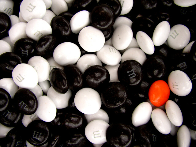
Considering that black and white are not colors, this should be perfectly fine, even though I'll probably get some comments about orange not being the primary color...
This was my favorite out of the 33 pictures I took of M&Ms, not to mention the 50-odd others I took of other orange subjects.
Bought 6 packs of the black and white M&Ms and 1 pack of the regulars. Tested various set-ups, just black, just white, mixed, ect. Tested different lighting (indoor & out).
I ended up putting them in a white ceramic bowl, mixing them up, and standing out on my back porch with the cloudy weather to get the best lighting. *sighs* Oh to have a studio... I don't like the reflections or the fact that there is a shadow on the right side by the orange one, but without spot editing I can't do anything about it. After the Brightness & Contrast adjustment, I only sharpened a tiny bit in order to leave a soft "glow."
Brightness -4, Contrast +22, Resize, Sharpen +2.
Statistics
Place: 78 out of 383 Avg (all users): 5.6295 Avg (commenters): 6.1538 Avg (participants): 5.4121 Avg (non-participants): 5.9469 Views since voting: 1483 Votes: 278 Comments: 17 Favorites: 0
I may be completely wrong - and maybe you didn't do any editing - but I think you may get some DPCers upset for going past the basic editing rule. I'm marking it high regardless because I really like the overall concept and the compositoin. It's very eye catching. Good luck!






 Add photograph to your favorites
 Add photographer to your favorites


 Photographer found comment helpful.


