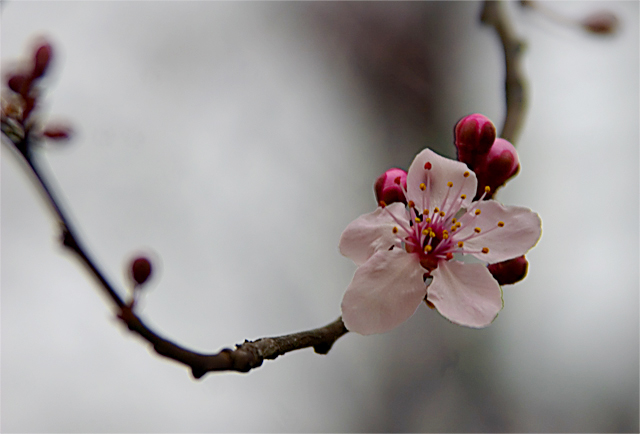
I really like the composition of this - the sweeping curve with that one blossom backed by those not yet opened. As a quilter, I'd say this is a cool pink - but with fabrics we work in tones, not absolute color. Based on the color wheel, reds and pinks are indeed warm colors, as is yellow. I suspect even though people might not know why, they thought this "cool" rather than warm (I'll look at comments in a minute). To make it warmer - warmer light (though I like the quiet light you have) or a warmer background. I suspect, though, had you stuck it in the cool challenge, you would have been told it was a "warm" color.
I like the simplicity of the single blossom. I was out taking some images the other day very similar. :-) The curve of the branch adds a nice gentle restrainer to keep the viewer engaged with the photo. Focus is a tad soft, which overall is fine, but I think this would be stronger if the details of the blossom were more defined.
Technically, the pink is a "warm" color. Somehow, the image feels cold and the pink isn't strong (or large) enough to raise the temperature IMO. The large bg area of white/grey is influencing the overall impact I think.
All JMO of course. :-) Good luck in the challenge.






 Add photograph to your favorites
 Add photographer to your favorites

 Photographer found comment helpful.


