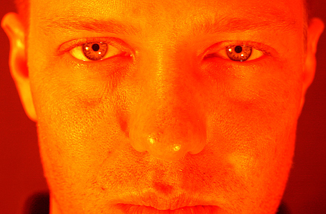
Although casting the eyes in orange is an excellent idea and it works very well the overall orange hue to the rest of this portrait is just too much and overwhelms the image. This would be better if it were not orange or if only the eyes were orange. The feeling I get when viewing this image is that it was made orange simply to meet the challenge. Every image should stand alone on its own merit independent of the challenge it is entered in.
Too many filters were used in this contest. In my opinion they really don't stand a chance against the crisp contrast of a smaller amount of orange used as the primary focus. His eyes really do look cool here, though.
Good use of DOF. Head turned slightly one way or another could have been more interesting. Looks like it may have been slightly over processed by looking at the left side of the picture.






 Add photograph to your favorites
 Add photographer to your favorites


 Photographer found comment helpful.


