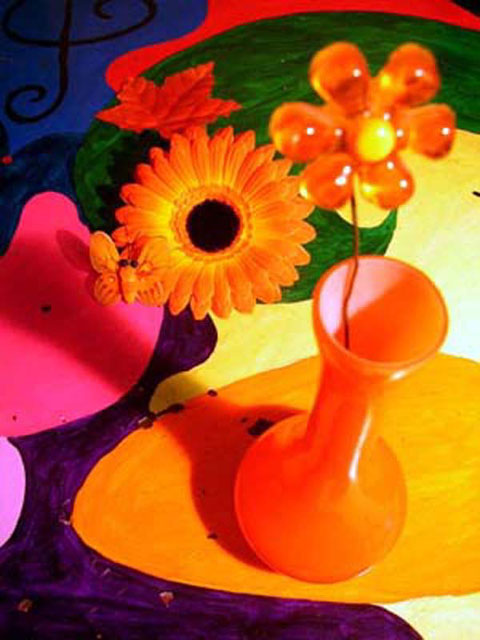
The colors and color combinations are good. This image is composed well and had great promise, but falls short in technical merit. Overall image quality is low. The vase with the flower is the main subject of this image but the background is in better focus and should not be. Greater depth of field is needed here. The splotches on the background are a major distraction.
This could be improved by more careful focussing and less harsh lighting to get rid of the ugly shadow.
the composition is very attractive albeit cluttered ,it seems to work as an abstract.
I think the shapes and colors here could be a cool abstract, arty looking photo. For me, the large plastic flower being out of focus hurts the photo a lot. I would like to see all of this in crisp focus and the lighting a bit brighter to make the colors "pop" more.
A couple of problems with this image:
1. The image is a bit too blurry (although I realize this could be an equipment limitiation issue) Maybe try using a tripod or better lighting and a faster shutter speed.
2. The positioning of the subject lends itself to an uncomfortable depth of field issue with the flower in the vase. Perhaps standing the drawing up and using it as a backdrop would have been better. It also would have helped you avoid the harsh shadow of the vase.
Just a few suggestions. :)
I think that this shot is a little busy with the colored background. A single color background would make your oranges jump out more. This also seems to me to be a little soft in focus. This makes it look blurry with all the elements here. A soft focus effect would probably have more impact with the solid background too with these warm orange tones.
TC





 Add photograph to your favorites
 Add photographer to your favorites


