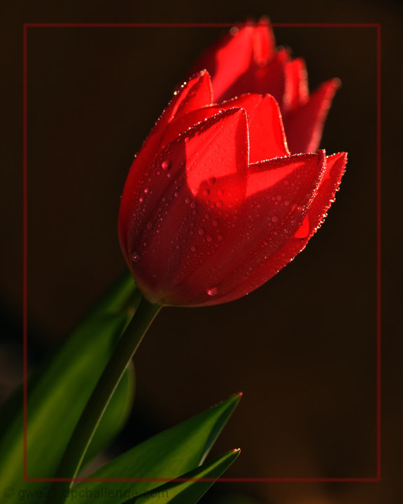
Wow, really nice image! the DOF is nice and the textures of the drops really pop. I might have expanded the border to not cut off the top of the flower, but it's not that big of a deal to me.
Wow what a stunner, who ever gave this a one is trolling like a mad man/woman. This is a great flower picture very dynamic and lots to look at the water droplet complement the flower very well. The lighting is interesting maybe a little softer would have been better. The flower in the back definitely takes away from the subject flower and kinda blend with it. I'd also have to agree with getting rid of the border does nothing for image. all in all spectacular image and another in this group that was under rated.
P.S. I really like the tone of that green I don't know why though.
Thanks for the comments. They are really helpful. I have another version without the border, but some things came up and I wasnt able to change the photos out before deadline.
This is my 1st Free Study entry and I am pleased with the photo.
Hi there... I’ll get right to the point. I think that the border around the picture should be removed. People add them all the time but they really take away from the picture. Also the second rose behind this one really messes this shot up. I think I would have held it down some how so that you’re main focus is on the first rose. I too have used the spray bottle trick (beer glass) and it work very good. What you should also try to do is mix in other ingredients that make the water a little thicker.
Also you may want to watch what time of day you shoot. The lighting can get very harsh and cause sharp shadows. You might try using an umbrella to soften the light creating a better picture.
I do like the soft focus on the stem though.
Congrats on making your second best picture.
Hi Erica, wait what? there's two flowers here? I thought it looked a little weird, but I wouldn't have thought about there being two flowers. I guess the second flower in the back is distracting then. I really really like the green leaves and the tones the the DOF in that area of the picture, it complements very well the flower. On the other hand, the flower is lacking something, it seems a little too dark and the bright areas of the flower cut very sharply into the less bright areas. Not sure if it was due to the harsh lighting or because you pushed the processing (contrast? curves?levels?) a little too far. What i'm talking about also is visible in the back flower. I really like your use of water to add an extra element to the image, that was really good. The last thing I want to comment on is the frame. I think the red of the frame competes with the red from the flower and is not a good combination. I like to keep frames as simple as possible since the attention should go to your image and not to the frame. I hope this helped.
The inside border doesn't really go over well here on DPC. having it clip the flower on the top doesn't help either. The way the background flower falls directly behind the one in the foreground, with the same lighting on them, the almost blend together, really taking away from what is a beautiful single flower.
Hi Erica. This shot is nearly a PB, so you can't complain there. :) This is a nice shot of this flower. When you are using a spray bottle, try to spray softer for larger drops, rather than blasting at full squeeze with lots of little drops. The exposure is pretty good, although I'd like to see a little more light on the green leaves, and a reflector would help to lighten the front of the flower too. I don't like the border at all. The red-on-black colour scheme is a very strong passionate scheme, and doesn't quite reflect the relaxation of 'morning glow'. Perhaps some orange sunlight falling across some pillows, or a cottage porch or rustic fence or something like would help to convy the relaxation of morning glow a little better? Just some thoughts, but in the end, well done on getting a top-2 image! (Oh, I just read the other comments, and I hadn't even realised this was 2 flowers! I thought it was all 1 flower, because they merge together)
Lovely tulip. Would like the one in back to be a bit less bright, I think, though it echoes the lighting and shape of the foreground flower there's a bit that looks totally blown on my monitor and that pulls my eye rather strongly.






 Add photograph to your favorites
 Add photographer to your favorites


 Photographer found comment helpful.


