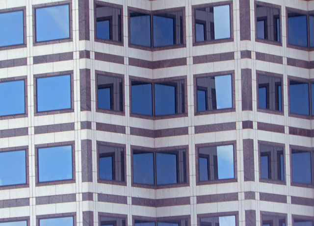
I'm having a hard time with the dimension. I can see the angles of the building, but they don't seem as defined as they could be. Perhaps send to Critique Club or to one of the forums for some more technical advice.
The pattern is great and the blue reflections are nice and smooth. The whole tone of the image seems a little washed out, however. I'll bet some curves adjustments could really make this one pop. There's also a bit of visible tilt that could be easily adjusted in PP.
This meets the challenge. The interest to me are the patterns created by the reflections in the bending part of the building. The left side doesn't really add much in that respect, though. Since it's basic editing, you can't fix any perspective skew - in this case, it may have been a good idea to try shooting at an angle, or cropping at an angle - that lessens the fact there is a bit of skew. Technically, it's a bit "flat", meaning it needs a bit more contrast - use either curves or brightness/contrast to increase. Also, it's not especially sharp, but not unsharp enough to seem intentional. Hope this helps!






 Add photograph to your favorites
 Add photographer to your favorites


 Photographer found comment helpful.


