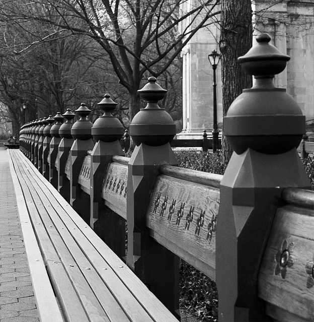
Lots of potential in this image. Maybe you could try cropping tighter , lose the columns (crop of 1/3 of the right portion). By doing this I think the focus on the patterns & perspective would be even greater. Currently with this crop I find that the columns & the lamp post does not fit. 6
I like the pattern of the posts, but I find my eye being drawn to that light colored building in the background. Perhaps a different crop may have helped it flow differently.
Nice perspective. The framing is pretty good and the focus/DOF looks to be spot-on. It just seems a bit "muddy" in my opinion. The black point is fine, but I think the lights need to be lighter. Just a levels adjustment would have kicked it up a notch in my mind.






 Add photograph to your favorites
 Add photographer to your favorites


 Photographer found comment helpful.


