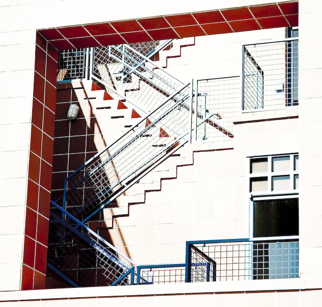
In this picture, I feel the red wall in front over-powers the stair pattern. My eyes are constantly drawn towards the left top of the frame which doesn't have much to add to the pic. Also a lot of variation of light from left to right which also hinders focussing on the lines which the photograph is about.
The overexposure was perfect for this in my opinion. Please be careful about taking advice/incorporating comments if by doing so it changes what you wanted to do with the picture. If you want to score better here, then by all means you should have properly exposed this. But I don't think it would have worked nearly as well as it did. Welcome to DPC and I look forward to seeing more of your work!
a bummer ... because the overexposure was deliberate with the intent of accentuating the patterns. otherwise, i thought the texture of the walls would interfere with the patterns that were clearly visible.
however, this was my first entry and a great learning experience. thank you for taking the time to post comments!
When I first looked at the photo at the beginning of the week I was thinking that it was too bright which took out some of the pattern. But the more I look at it the more I see that the sun gives a second kind of pattern which is intreguiging and would have not noticed that at first glance myself. Now that I see it clearly I can now vote it higher than what I previously voted. Well done and fantastic vision for this challange.
Would have liked a less high key approach. otherwise I feel this image with right amount of post processing to bring out more details can be a high scorer. 6
I may have to come back to this one... I can't decide if I like the blown out white or not... which, I guess is better than definitely not liking it right away... hmmmm....




 Add photograph to your favorites
 Add photographer to your favorites

 Photographer found comment helpful.


