I didn't even think about the "Patterns." Good job.
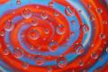
The colors are amazing. I never would have thought of that. I'm a little iffy on the yellow, of course, but green and blue are two of my most favorite colors. Haha, guess my third, if you can.
I love it. Even the little 'shine' at the top right just looks like it belongs there.
Oooooo goody 4th place! Isn't it the best? I mean in that "so close to that little splash of yellow, I can taste it sort of way?" : ) Just teasing of course...great score & finsh. Congrats Yanko! Your average is getting rediculous BTW!
This entry lacks the strong repetition of my other top picks for Pattern, but the sheer artistry of the composition is awesome. I could easily see a large print selling for thousands just for its beauty, and this would be equally appropriate for a Free Study. Nice! 9
Finally figured out the pattern...blue, yellow, blue, yellow then combined for the green. This is almost too abstract for this challenge, but you have done a great job with intrepretation.
Beautiful colors - in true DPC eye candy fashion. Something in the slightly dark feel of this shot makes me think I might know whose it is. Clearly the work of a true professional. ; ) Back to bump you up to 9.
Remarks: Variation is a wonderful thing when repetition is the theme. Here it just flows conically in- or declining, through the frame. What's striking is that the pattern is forever changing while maintaining a constant of shape and line (I suspect the foreground green outlines a curve too large to be contained by the margins).
The diagonal perspective is dynamically placed, too, against a measured rhythm of rush and recess. The (apparent} bouquet suggests a similar progression, sans the plastic relief of the fore- and middle grounds.
I converted the image to black and white (gradient map) to see if the colours provided a critical element. My impression was that it held its own, albeit intrinsically like cello in a jazz quartett. It did, however, loose the contemporary sense of the colour version.







 Add photograph to your favorites
 Add photographer to your favorites

 Photographer found comment helpful.


