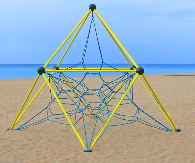
This is a cool little contraption, There is a lot of negative space so i like how you made good use of it with the crazy blue sky and water. those orange specks opn the right are a bit disracting though...
I like the bold simple structure here. The waterline and sky intersecting it seems to take away from my view of the main subject. I'm looking at the beach scene through the stucture. Perhaps a perspective view, closer in, could have added some punch.
The subject looks like it's been pasted into a photograph of a beach. Also, the gradients between the sand, sea and sky look very harsh. Overall it looks overprocessed, almost fake. -5
The use of colour is what makes this shot pop. I would look to take the shot from a different perspective because this is perspective is an everyday view of this struction.
(1) There are two horizon lines here that are not parallel. If they weren't close to being parallel. that would be fine, bur because they are close, it makes it look like it was an error in composition.
(2) The structure is close to, but not centered. Again, if it were way off center it would look intentional and would be fine, but because it is close, it looks like a mistake.
The thinks I really like are the vivid colors. I like that there are large portions of the image that are the same color. It's a bit of cubism in that way. I also like that the subject is IMO exactly what this challenge is about.
I like the color contrast in this one. I think a really whacky crop could turn this into a nice abstract. As it is, the centered composition is a bit static and feels a bit flat.
pretty colours and interesting pattern in the structure, but the comp is too centred and thus tilts it to the boring side. A change of pov (maybe laying down by one of the legs and shooting through the ropes?) would've made it more interesting.







 Add photograph to your favorites
 Add photographer to your favorites


 Photographer found comment helpful.


