|
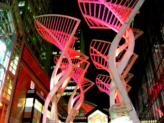
I really like the structure and the idea, but there are waaaaay too many distracting elements. The bright lights in the building on the left and on the bottom are bad. The ones behind it you might be able to get away with if you cropped of those. It also seems like the orange/pink structure isn't as in focus as the buildings on either side, I'm not sure if that is because of the lighting or what though. Also, try not to cut off the top of the one on the right. If you made this a horizontal picture it would probably fix most of these problems. Score: 4 |





 Add photograph to your favorites
 Add photographer to your favorites


 Photographer found comment helpful.

