I'm one of your 8s. I loved this, your title made me think of it as "movie poster" art. Not exactly what you intended, but I still think you should have scoredd higher. Guess it's the bias against abstracts. Even though thtat shouldn't be the case in a "Pattern" challenge.
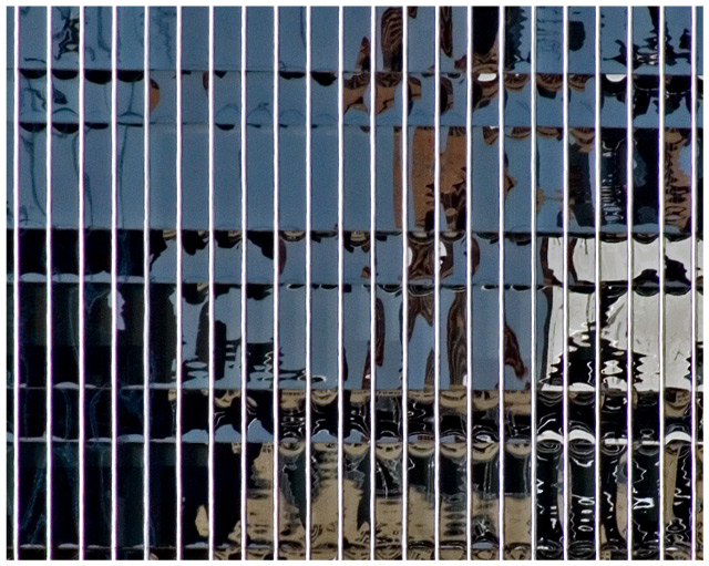
I did see the lines more as negative space elelmets - to me the pattern (not a recurring symetrical one, obviously) was the horizontal lines of the reflection. I kept trying to see faces (who's the star of this movie? lol).
Thank you for answering the question. There are several stars depending on your perspective. The first is George Washington at the upper left and the last is ET the extraterrestrial on the lower right. James Bond and Michael Jordan are interspersed as well.
Now, really drilling deep into the abyss, does anyone check back to see if, after they make a comment, the person who took the photograph responds in kind? Particularly if its several days later?
I'm one of your 8s. I loved this, your title made me think of it as "movie poster" art. Not exactly what you intended, but I still think you should have scoredd higher. Guess it's the bias against abstracts. Even though thtat shouldn't be the case in a "Pattern" challenge.
I did see the lines more as negative space elelmets - to me the pattern (not a recurring symetrical one, obviously) was the horizontal lines of the reflection. I kept trying to see faces (who's the star of this movie? lol).
So, are you wanting us to look past the obvious vertically linear pattern into the abstract ones in the reflection? I'm guessing so as the title sort of indicates that. My problem is the general lack of depth. Everything is demanding my attention at once and it is almost too much visually.
While the pattern is obvious, the reflections are too ambiguous for my taste. I would have preferred a shot where I can actually make out what the reflections are about. Maybe that would have happened if you'd taken the shot from a farther distance. -5
The reflected image is so broken up that I can't even guess at what it is that relates to the title. The image as a whole is ok, but it does not seem to have much punch to it. A little noise reduction and sharpening might help, but I am not sure.






 Add photograph to your favorites
 Add photographer to your favorites


 Photographer found comment helpful.


