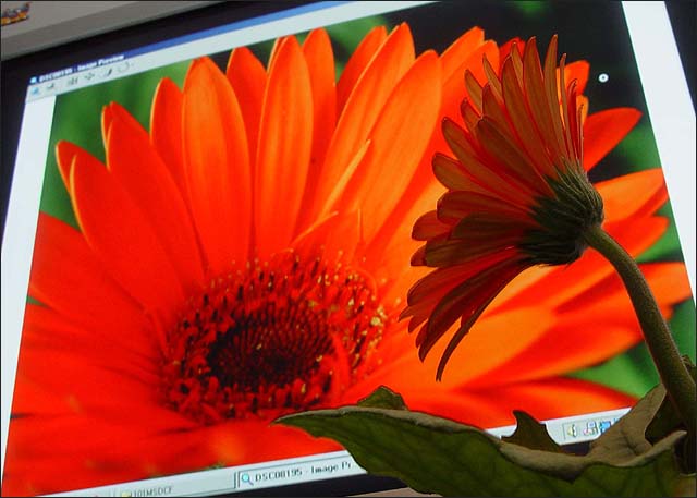
Cropped, resized for dpc and sharpened.
No color, levels or contrast adjustment was needed.
I took the background shot at the garden center and bought a potted flower just in case. Good photos but they looked pretty boring. Thought I'd have some fun! I lost some quality on the resize.
Wow! That was fun. Thank you so much for the 36 comments. I had to work at obtaining just the right lighting and dof. The garden center flower was brighter orange than the potted one I bought. When I focused on the real flower the color contrast was too obvious. I tried many combinations. One other shot was better but I really liked the "pointing" on this one.
Thanks again for all of your comments.
Statistics
Place: 67 out of 383 Avg (all users): 5.7053 Avg (commenters): 7.1176 Avg (participants): 5.6289 Avg (non-participants): 5.8016 Views since voting: 1816 Votes: 285 Comments: 39 Favorites: 6 (view)
(I think. I've only been here a couple weeks and the first time I saw it I thought the water droplets were original. Or the inverted colors within the glass. Hmmm, now I'm all paranoid about saying things are 'original'. But, really I like this idea...)
Clever, funny anthropomorphism. Somehow, it would have been nice to get rid of that emblem on the monitor (in fact, to only have the monitor face and not the bezel.
hahha. This is a cool idea. I think it might have been a more appealing image if you hadn't shown that it was on the computer screen. Perhaps better on a print of the macro shot. Still, a creative and refreshing floral shot. :)







 Add photograph to your favorites
 Add photographer to your favorites

 Photographer found comment helpful.


