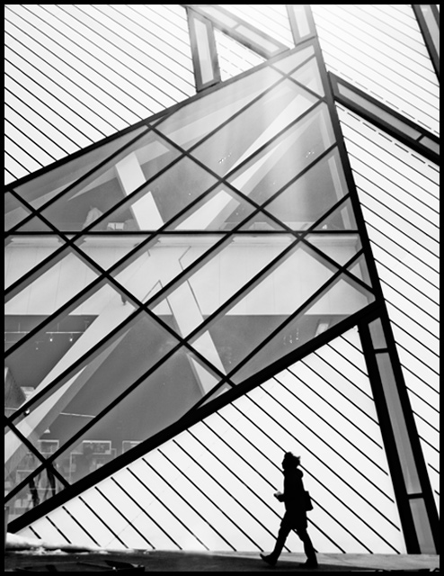
I copied my friend LanndonKane on this one. :P I think his is better cause i got lens flare at the top so i had to crop a lot. Anyways hope for a 6.0+. Unless people really hate that lens flare.
Statistics
Place: 48 out of 290 Avg (all users): 5.9175 Avg (commenters): 7.2308 Avg (participants): 5.7561 Avg (non-participants): 6.0357 Views since voting: 890 Views during voting: 293 Votes: 194 Comments: 17 Favorites: 0
A very strong image, with good use of the single pedestrian in the composition. I do wonder if you might have been better cropping at the apex of the window, thus reducing the slightly weaker exposed area at the top of the frame?
So many patterns, so little time. I think my biggest problem is coloring, or lack thereof. I am not a photographer so I really can't explain what is missing, it is probably in the editing. Was this desaturated? Was it b&w? Send this to the Critique Club and see if they have any suggestions.





 Add photograph to your favorites
 Add photographer to your favorites

 Photographer found comment helpful.


