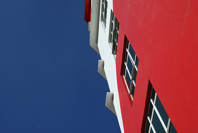
Strong colour. Excellent composition. It's so simple, which is what makes it such an effective image. I hope it doesn't suffer from people not seeing *enough* of a pattern. For me, the only thing I can fault in this, is the red is an iota flat...
I really like the perspective view and the strong bold colors here, but I think the centered landscape crop may have been the wrong choice. A portrait orientation, with the building taking up more of the frame, may have had better visual flow.
The colors are stunning! The angle seems harsh to me, but the red & blue are difinitely in the primary color range and those colors are pretty "brilliantly harsh" so maybe it does work...artistically.







 Add photograph to your favorites
 Add photographer to your favorites


 Photographer found comment helpful.


