Author Thread Comments Made During the Challenge
Post actions
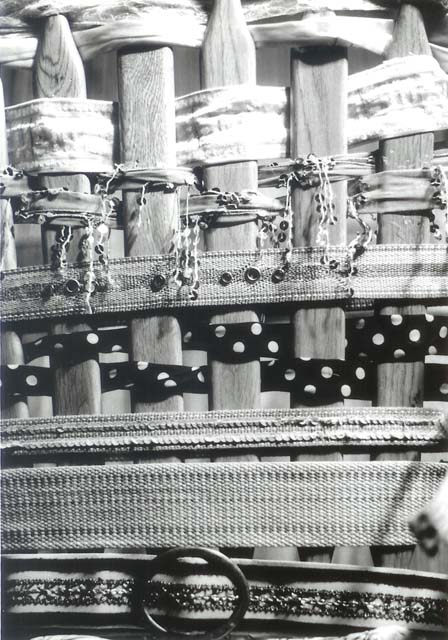
would have been nicer in color...
Post actions
Post actions
Good idea lots of pattern good contrast
Post actions
Post actions
I think this is over-exposed.
Post actions
good idea but far too many items competing for the spotlight. Less means more impact if shot well.
Post actions
A little difficult to score this image, I like certain parts of the image (the middle portion) but not the entire image. The overblown top portion is distracting & the little blurred portion on the lower right is also distracting. I would probably have cropped tighter leaving out the top & bottom portions.
Post actions
Got it! You used different patterns (& textures) to create the shot. Honestly, I would have liked to see the colors as well.
Post actions
nice picture, but its a little hot at the top and monotoned
Post actions
This looks to be lacking in contrast, but an interesting idea
Post actions
This would have been better with more contrast
Post actions
It's very difficult to determine what I am looking at at first. Perhaps a way to make it easier to tell the individual aspects apart? Maybe color?






 Add photograph to your favorites
 Add photographer to your favorites


 Photographer found comment helpful.


