|
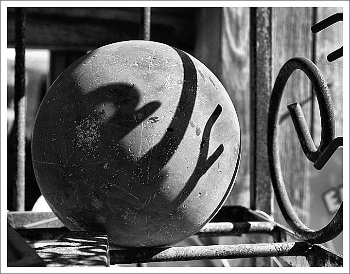
This I like a lot. Dare I say that the 'E' is now distracting, but I think it could be cropped or, better yet, cloned out pretty easily. Anyway, I think the shadows are bolder in this version, and really help to punctuate the at-sign effect. Also I think the black-and-white really brings out the rusty, weathered textures here. Nice job. |




 Add photograph to your favorites
 Add photographer to your favorites


 Photographer found comment helpful.