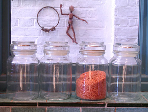
Too washed out. The black edging of the tile draws your eye more than the orange and the figure in the back doesn't seem to serve any purpose. The reflection doesn't bother me and I like the offset of both the container and the figure in the back, however could you make the distance between the containers even? Perhaps even not influde the sides of the window as a frame, unless you are going to on the top as well, the picture is contained, but then released all up there. Score: 4
This is great. Lots of visual elements here. I find the figures on the wall stealing the limelight from the orange subject. In fact my eyes focus on the figures rather than the bottles. Perhaps taking this at a shallower DOF at a larger aperture (to blur the background a little bit) would do the trick. Nevertheless, it shows that you really put a lot of effort for the challenge and your results are quite beautiful.





 Add photograph to your favorites
 Add photographer to your favorites


 Photographer found comment helpful.