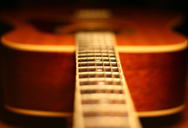
Took this on our kitchen table. You can see some coasters holding the guitar up, which I needed to hide. Also I think it has too close of a crop. I didn't have much room to work with though and wanted it to be symmetrical. Lighting included a flashlight ran down the neck of the guitar and then a quick flip of a kitchen light before the shutter closed.
Post processing included brightness, contrast, white balance, sharpened, cropped, save for web.
First entry (though a long time follower): Rip me to pieces.
I LOOOOOOVE DPC
Statistics
Place: 251 out of 290 Avg (all users): 4.6755 Avg (commenters): 4.1429 Avg (participants): 4.3919 Avg (non-participants): 4.8596 Views since voting: 635 Views during voting: 275 Votes: 188 Comments: 15 Favorites: 0
Good idea, but I think the shot would be better if the aperture was reduced allowing a greater depth of field. Also the focus should be done on the beginning of the fretboard, not in the middle.
Unfortunately at your point of focus, the focus is still too soft. Image needs to have more DOF & crisper focus to have more impact. Overall composition is good.
I don't know if the narrow DOF works well here. It is so narrow that you have to look twice to see if anything is in focus. I do like the concept. The colors are engaging and the lighting looks pretty good. The body of the guitar looks to be pretty well centered, but the fret bar is not - I think that takes away from the image a little.
I bit of a stretch for me, but I see what you are doing. Interesting use of dof to bring the eyes to the center of the neck. This is a choice I haven't seen used much, not sure if others are going to appreciate it. Oh, back to the challenge. If you could have taken this shot and showed only the neck, I would be more inclined to accept, without question, how this fits the challenge.
The tiny DOF was distracting to me. I'll give an "A" for effort, but I have mixed feeling on the pattern. It does not seem to stand out as well as many of the others.





 Add photograph to your favorites
 Add photographer to your favorites


 Photographer found comment helpful.


