Author Thread Comments Made During the Challenge
Post actions
Simple but very effective and a type of shot I really like
Post actions
Post actions
I really like the simplicity here. you might try running neat image on it to clean it up a bit, especially with the high contrast lines.
Post actions
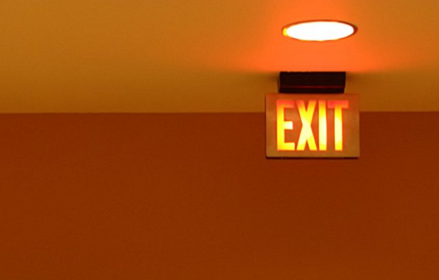
Very nice use of negative space. However, too much compression or too little pixels. Sharpen it up a bit to bring out the sign. Try cropping out the light and simplify the whole thing with just the sign and the wall. Score: 4
Post actions
The subject appears to be the Exit sign. But it's very soft.
Post actions
I adore the composition of this photo. It's simple, it's clean, I really like it. I would have scored it higher if it were clearer. Good job.
Post actions
something about this one I really like....nice job
Post actions
Post actions
Out of focus, nice color.
Post actions
nice simple and elegant capture. I like the way the edge of the wall and ceiling provides two tones for the background. Focus is too soft though.
Post actions
This image would have scored 2 pts better if it had been sharp. Got Tripod?
Post actions
very nice composition. I like this a lot. 8







 Add photograph to your favorites
 Add photographer to your favorites


 Photographer found comment helpful.


