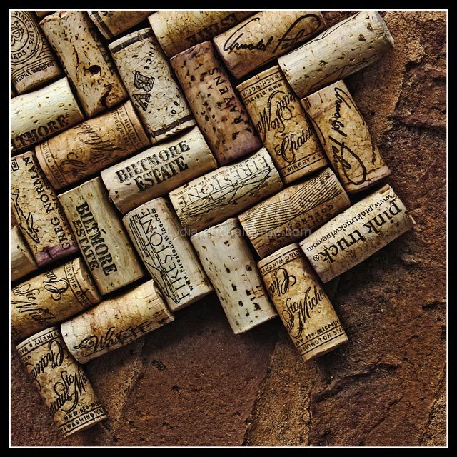
I think I might like to see this just shot without the bricks.... only corks... hmmm. I could totally see this hanging as decor in an italian restaurant or wine bar.
Nit-picky Nellie here. You've got the chevron pattern, you even have ahint of pattern from the bricks, but you missed one. The names of the wineries. They are right there on the corks. Why not set a pattern with those as well? As much as you can.
This has nice details and warm colors. the exposure and lighting are good too.
even though this one shows more details in corks, I prefer the ctf version. more background gives meaning to this arrangement of corks. why would one arrange the corks this way? the relationship between background and foreground stops that shot from being just a shot of "neatly arranged corks". the contrast between brick color and white cork color works very nicely too. even the composition looks much more appealing and balanced in that one.
I like the way you put these two different textures together. Really intreguing photo. Would look good hanging on the wall of my wine room if I had one. :)







 Add photograph to your favorites
 Add photographer to your favorites

 Photographer found comment helpful.


