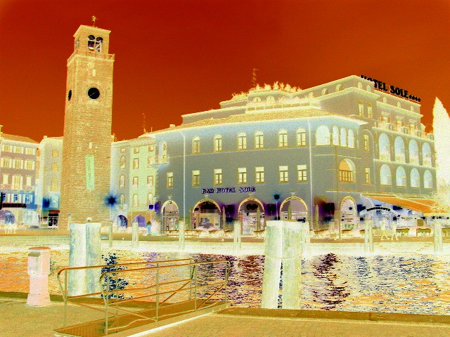
Challenge:Orange (Basic Editing I) Camera:Sony DSC-V1 Location: Riva del Garda - TN - ITALY Date: Mar 20, 2004 Aperture: F/4 ISO: ISO -800 Shutter: 1/8 sec Galleries:Urban, Digital Art Date Uploaded: Mar 22, 2004
It's extream... but I like the effect sometimes... I'm assuming its inversed. I did it on the last challenge and took quite a hit (bad) for doing it. (dilapidated for "paralell lines" challenge). Thanks for putting up something strange.
Turning it into a "negative" is not taking an interesting picture. Yes, there is a lot of orange, but it was no in the original. Try cropping more on the left to cut off the lonely spire edge and then add more of the tree to the right of the hotel. Score: 3
Not sure what you were going for here, just looks like a negative to me.
My advice is that most of the time, very "manipulated" images like this won't do well in a competition. The image might have been ok in normal format, though it looks like it might need ome perspective correction per the tower.
Compositionally a good shot. The hue/levels thing or whatever you did with it to give it a orange tone doesn't flatter the image. Some people like the effect and sometimes it can be a nice touch but to me in this instance it is over done (I've done it myself - didn't work for me either) 2
Globally changing the colors from reality removes phtographic integrity. All senses of reality have been removed from this photo. As digital art, it is an interesting piece, but I wouldn't consider it photography. (Unless viewing negatives)
try changine the perspective of the image in PS to straighten the tower. See my paralell lines (i can show you the original) for how much better a strait pic is thatn a crooked one.






 Add photograph to your favorites
 Add photographer to your favorites


 Photographer found comment helpful.


