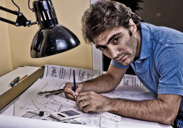
You did a good job at catching my eye. If this is not tonemapped (the basic editing version of course), then I'm really curious how it's done. Everything just stands out in this photo.. I like. 8
I don't know what it is maybe all the hair but this it almost like he was drawn. Even the texture of his shirt seems unusual.
Dont get me wrong I think this is a good thing and makes it an interesting shot, I'd be interested to know how you achieved this. I kinda wish you'd dusted that lamp though....probably just the clean freak in me speaking out. And the title bugs me as its well lit and doesn't have the feel of a late night.
an architect or draftsman i presume. i like the post processing and eye contact a lot. composition is appealing and very well-suited too. background could have been a bit better (homogeneous instead of two distinct halves) 8
This pic has some very strong elements, such as lighting, composition, pose and facial expression. It fits the challenge very well too, and it might score well or even very well. I am put off by post processing though. To me, this looks like a paintbrushed image rather than a photograph. I am not sure what you did and whether it is legal in basic. Bottom line is I think you did too much of it and ruined a great picture.
This "dave hill" type technique does not always work, and I think this is a case where a potentially good and interesting shot is ruined by trying out that kind of processing. The processing on the face makes him look somewhat ill. Take the original and process it again with a more natural look, rather than the plastic type look... 3
I little too "Lucis" for me. In the event you didn't use the Lucis tool, then it is a little over-processed for my taste. However, this is only my subjective taste, so I won't vote, just so I don't bring down your score.





 Add photograph to your favorites
 Add photographer to your favorites

 Photographer found comment helpful.


