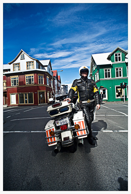
The aim with the processing was adding "pop" to the image and high saturation. Uesed Clarity slider in Lightroom, USM and High-Pass in Photoshop to add further to pop and enhance contrast. Slight dash of shadow highlight to fine tune shadows and mid-tone contrast. Did probably do minor adjustment to color with Color-balance tool. Would have lightened up his face if it was advanced editing to show the shades. :)
Statistics
Place: 18 out of 159 Avg (all users): 6.4275 Avg (commenters): 6.5455 Avg (participants): 6.2281 Avg (non-participants): 6.4829 Views since voting: 2235 Views during voting: 420 Votes: 262 Comments: 26 Favorites: 2 (view)
So is he a Police Officer? Or just a rider? Hard to tell from the distance of the shot. Additionally, I don't think the houses add anything to this. Too many shadows in the face.
great shot. I like the location you chose with the contrasting color of houses. I actually think this might have worked nicely cropped in tighter as a horizontal.
Skemmtileg mynd, lögreglumaðurinn er nokkuð vel staðsettur á myndinni og litskrúðug húsin koma vel út. Hefði helst, ef eitthvað er, viljað sjá lögreglumanninn aðeins neðar á myndinni svo himininn fengi betur að njóta sín, sömuleiðis eru skuggarnir aðeins að hrella þig.
Lovely colors, and great framing along the center axis. I really like this image. Some of the other very good portraits in this challenge dont have enough environment, this one suffers from too much environment, and almost no face or expression. While this framing makes it a very stong shot, it loses a point or so for not being as good a challenge entry as it does a composition.
excellent use of wide angle, composition couldnt be better, colors are simply brilliant...my major concern is, where is the face? this could have been an easy 9 or 10 for me but giving you 6
I really like this. Great contrast and colors, good composition, interesting subject. I sort of feel like his motorcycle should be facing the same direction he is, though.
He is a case where the "dave hill" type look actually works. The exaggerated colors of the sky and houses work well with his black suite. The processing and the composition is well done, although, either the photo needs to be rotated slightly or there is some barrel distortion in the lens. My only other gripe is that the shadow from his helmut almost doesn't make his face visible. However, the more I look at it and connect it to the title , I think that shadow might work, as it makes it as though this could be just a generic cop...either way, this gets a 7 from me





 Add photograph to your favorites
 Add photographer to your favorites

 Photographer found comment helpful.


