Good rule of thumb: If you ask for an in depth critique, you should be willing to include your own comments with your photo when you submit it. Does this photo not have any meaning or interest to you personally? If not, it's not worth asking for an in depth critique. You have to care about it before you should ask someone else to do the same :)
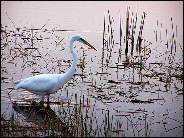
A beautiful picture, but magazines are almost always vertical format. If this were cropped right to the bird, with the open water at the top it would be perfect - that water would be a great background for the type and the picture would stand out well.
(I'm writing this to everyone who submitted a landscape shot) The challenge was to produce a shot worthy of a magazine cover but to me a shot like this is not suitable to be put on a "portrait" format magazine.
---ADDITIONAL---
Due to forum discussions and accusations that marking landscapes down is nitpicking, I'm going through them and remarking. I still think some of the landscapes would not make good covers because of their orientation but I am no longer marking down because of that.
I still think landscape is inapropriate for the majority of magazines but I'll give the benefit of the doubt to the photographers.
Wow! This is an awesome shot. This is top quality and pitch perfect. I'm going to give you a high mark; however, you may find others will mark you down for having a horizontally cropped image instead of a vertically cropped image. IT seemed to be an issue in the last magazine challenge.







 Add photograph to your favorites
 Add photographer to your favorites


