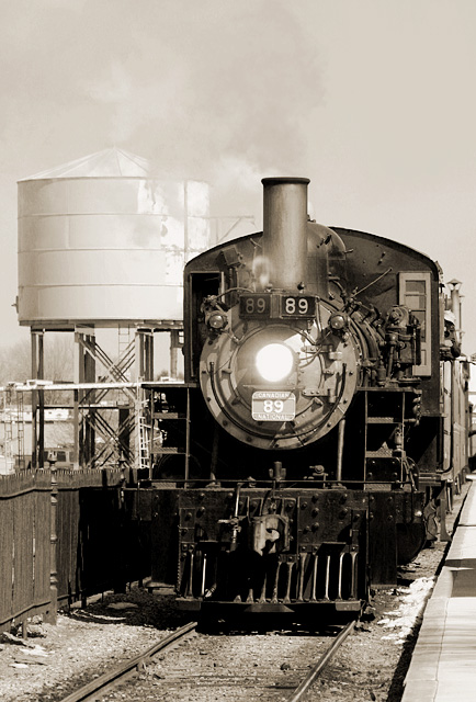
The message This is a wonderful photo that would make a great magazine cover. It effectively conveys the essential character of the classic train.
Creative choices The sepia is perfect, giving a "classic" look that enhances the message. The water tower in the background makes a great setting. The composition isn't bad, and probably great for a magazine cover, but I would like to see just a bit more to the right; the engineer is too close to the edge.
Technical aspects Focus and sharpness are great. Exposure isn't bad. Details are lost both in highlights and shadows, but there's not much to be done about it; there is just too much tonal range for a camera to capture here.
Nice shot, great composition for a magazine cover. However, there seems to be too much detail in the shot, I would prefer more simplicity... there's just too much for the eye to look at which leads the eye away from your train. The light seems a little harsh, and it's unfortunate that shadows obscure a lot of the detail at the front of the train.
I think that if you stood right in front of the train it would have been a bit more exciting (for you as well as the viewer) and the composition might have improved (but obviously not your life expectancy). I think this is a great shot, and one of the best at fitting the challenge (I can very easily visualise a type face in the top portion of the picture). Very well done - 9.
Don't know about Classic, but this is a terrific photo. I like the sepia tones for this image, and the cropping is just perfect for a cover. Great job.
Awesome. Absolutely awesome. The toning and b&w is so perfect I want to download this and hang it on my wall NOW!! This one has got to be in the top 10. :) I'm thinking you maybe should have cropped so there's less sky and more of the track. anyway, 9.






 Add photograph to your favorites
 Add photographer to your favorites


