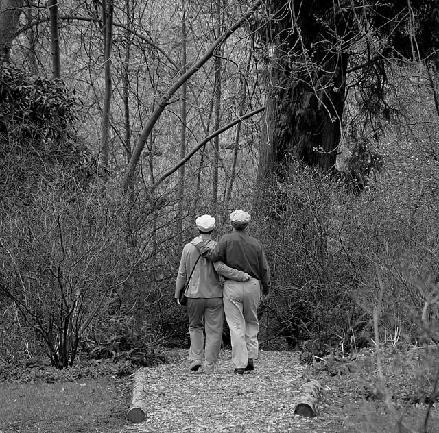
It has been interesting, indeed, to read the comments on this photo. I was genuinely surprised by the perception of a 'dead end' here.
Of course, no one can know that the path does not, in fact, 'end' here (it veers off to the left and through the forest), the forest itself, to me, is not akin to a wall but rather to a garden. It symbolizes life, a quality of life and freedom from the restrictions and orders of 'civilised' existence. The alleged 'dead end', to me, really represented a gate and a transformation.
Even 'death', as a consequence of a 'dead end' interpretation, appears to mean different things to different people. In the context of this image, I felt (quite simply) it suggested an integration into the natural order of things, something which places me at considerable philosophical variance with the views of others.
Facit? As a photographer, I might do well to step out of my own sandals once in a while and wear something different, just to see how it goes. ;-)
Thanks for pointing this out. I would have never dreamt of it.
Very good shot. I'd like to see more of the sides cropped off. BTW- there's something a little unsettling about retirees walking into an apparent dead-end. It's the End of the Road...
Very nice and apt picture for the title. Excellent range of tones. I love b/w pictures but think this one would have been more pleasing in color because you included spring in the title. If spring isn't green, what is? Anyway, that's just my opinion.
This is a classic. The naturally curved branches, the detail, the tonal range. The natural pose and ordinariness of the subjects with their matching hats is wonderful, this looks like a shot where every detail was planed and set to enhance and highlight every other aspect of the shot. The couple ooze a mature emotion/connection to each other and the world around them. Perfectly executed , wonderful work.
Photo seems oversharpened, with too much texture and detail in your composition. The eye is not led to your chosen subject of the couple. It seems a bit offputting that they seem to be walking into a dead end... a bit unfortunate for a magazine aimed at older people!
Also AARP :-). Wow, this is one very well thought of subject matter and composition. You even left space for the title above them. Good job! (I don't know what the format is of your magazine but if you crop it to the usual magazine size, it will even be more fitting, but I am being petty.)
Wow! This is an awesome shot. This is top quality and pitch perfect. I'm going to give you a high mark; however, you may find others will mark you down for having a horizontally cropped image instead of a vertically cropped image. IT seemed to be an issue in the last magazine challenge.





 Add photograph to your favorites
 Add photographer to your favorites


 Photographer found comment helpful.


