Thanx a lot for your wonderful comments on my 2nd pic in dpc. They really made me proud!
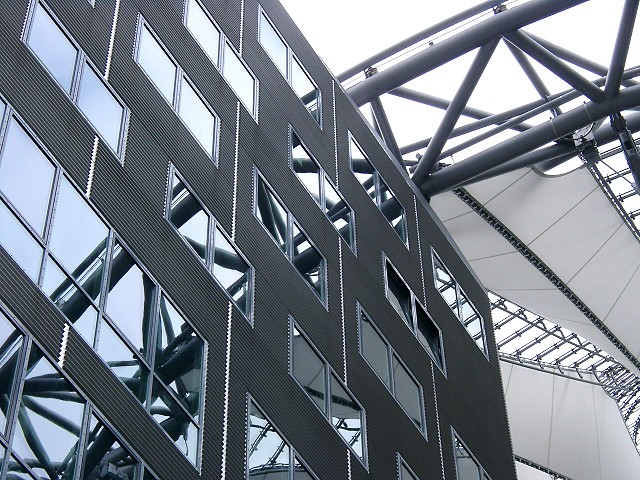
@KAOS: Sorry, but the sony center isn't much more colorful, and spot editing is not allowed... IMHO the lack of colours accentuates the composition with shapes and lines. But i'll try to make a more coloured shot for you in future ;-) Greetings back to Erlangen and only the best for you!
This is one that just looks great in full size but nothing much in thumbnail. The texture in the wall and the silver frames and dividers is just wonderful. I love how the curve of the metal structure continues through the reflections. The sails are lovely and the overall composition is very good. Bumping up to 9, Kavey
This is growing on me. First glance said to me, uninteresting, but more viewing helps. The reflection seems to make the superstructure continue past the top of the building, very nice. Bump 1 to 8. Swash
this one feels 'almost there' to me - there are a lot of great elements, but it seems a bit too confused. Maybe even just focusing on the windows(?) on the lower left and leaving the gantry to the reflection might have made it less confused ?
Why grey? I think, this motif would look better if it were colored!?! ...maybe I'm wrong! I like the idea with the continued arc! Greetings to Berlin! 7 KAOS
I like the geometry in this photo. Also, it is nearly b/w, without ACTUALLY being b/w, which means you have a very consistent color base. A little overexposed. 8






 Add photograph to your favorites
 Add photographer to your favorites


 Photographer found comment helpful.


