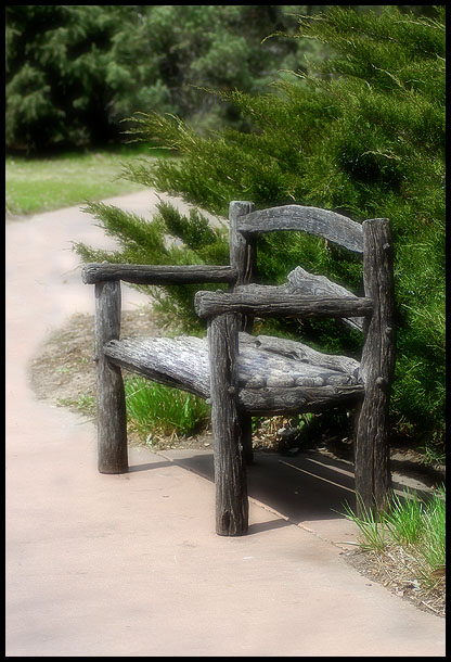
Like the colors and the composition so much but it does look a bit stiff or unnatural. Anyway, that is my personal opiion. I will score it relatively higher. It has a certain rustic appeal to me. 8
I like the simplicity of this image. The lines are nice and clean, no clutter, and the composition would work well for a mag cover, I think. If anything, I think it needs a bit more space at the top, a bit less at the bottom.
Rule of thirds please. drop this facinating subject onto the lower right third, and I can get a feel of destination for the path. I want to sit on this bench and listen to it's stories. Give me a feel for the path, and I think you capture magic.
Photographically... very well done. Subject matter, however, is a bit missing. Mostly the lack of texture in the walkway. The large area of blant space below the bench pulls the attention away from the subject and offers little in itself. Maybe if you cropped the photo higher to remove the area under the front left leg and included more of the trees above it would have been more balanced and would have brought the subject lower allowing for space for the magazine title.
Why so centered. Move up a little to make it more appealing visually and also leave so room for the magazine title. Still, this could work. One of the better ones actually. I like the soft focus and the colors and lines. well done.





 Add photograph to your favorites
 Add photographer to your favorites


 Photographer found comment helpful.


