I seem to "draw" your pictures a lot. I can't decide if it is fate, karmic retribution, or a conspiratorial re-education plan.
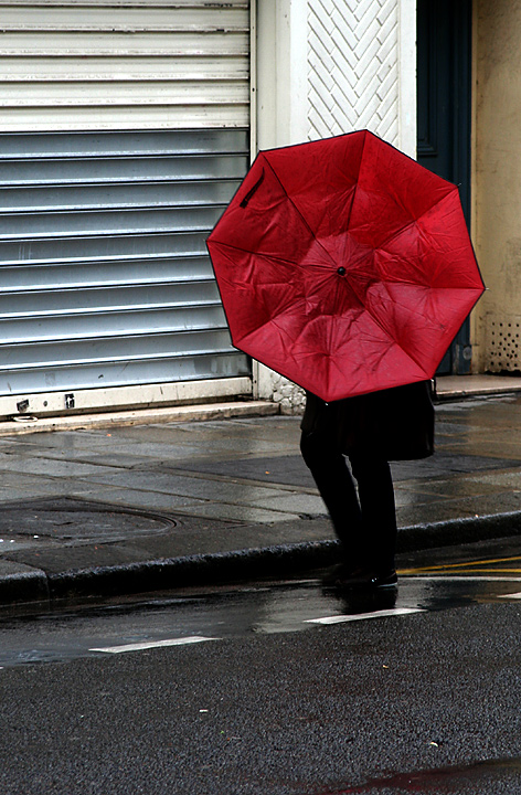
Compositionally, it is well balanced and the red umbrella does well to attract, and keep, the viewers attention.
Technically, it is well focused, lit, exposed and processed. It has a good level of contrast and the details are visible throughout.
What I like the best, though, and what I suspect may have put some people off is that the person is completely hidden from the viewer. I like that. It speaks of "everyman" and could be any one of us in that same situation. It also reminded me of my freshman year at Appalachian State where I actually attempted to carry an umbrella, only to have it blown inside out repeatedly (Upperclassmen just buy a big poncho to cover their backpack and what not).
I think it is a very well done shot, on several levels, and would have like to see it score higher. Great work, once again.
Love the boldness of this photo. Really grabs you and the differentiating textures all arranged nicely in the frame really make this one. Have fun in Paris.
I found this one of the better harsh environment photos. I think the way DPC voters are though, it has to be so literal, it knocks them in the head. LOL
Oh cool, you guys are in Paris! This is such a European scene, with the street environment and the red umbrella. Love how that color stands out. Good job holding your camera still on such a windy day :) Beautiful title.
Ok, with all of the "harsh" scenery shots in this challenge, all of the birds eating insects/wildlife.....THIS shot really stands right out! LOVE IT!!! I'm not a traditional voter in the sense that I go for the "highly manipulated" scenery shots so, this one really hit me well! I think we need more photos like this in DPC and hopefully, voters will eventually see the "value" in shots like this one.
Not sure how you're doing score wise. My bet is that your score is kind of suffering somewhat due to it not being a traditionally "loved" shot here, but to me, it's brilliant! Nicely done! 9
very well done. I like the off-center composition and the sense of place, the dominance of the red element. I think it might look better with a crop off the bottom (say 15% or so), but that is a nitpick even if true.... 9






 Add photograph to your favorites
 Add photographer to your favorites

 Photographer found comment helpful.


