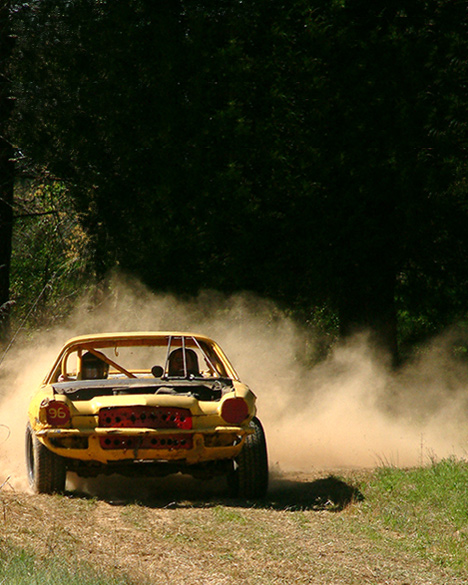
Good composition, especially good negative space for title and blurbs. The lighting is good, as is the color, with the smoke almost acting like a leading line from right to left. If I were to say anything negative it would be maybe wanting the car a ltitle closer and a tad sharper, but it's fine as is.
This may not do well, but I can see this clearly as a mag cover... the reason is the large dark area above the car which would be perfect for text, etc.
Well, at least somepeople realized that magazine covers need to leave some space for titles and text. Very well composed. Had there been more detail for the drivers, it would have improved a lot. But given the circumstances, it's not easy to meter for light when the subject is zipping past you.






 Add photograph to your favorites
 Add photographer to your favorites


 Photographer found comment helpful.


