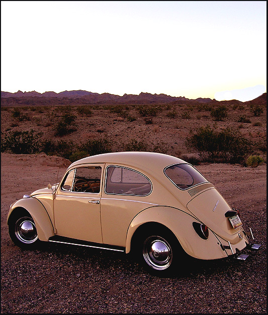
I love this photo - the lighting and scenery are perfect. I like the open sky, which would lend itself nicely to a magazine title. Lots of room at the bottom too, for text/barcode/etc . . . great job!
i think this could have been much brighter and could use some green in the background to contrast with the neutral color of the car. it would make it more powerful to me, anyway. great car though - looks like it is in great shape!
What a great shot, looks so much like the pictures on the front of car magazines. If the colors were more saturated and vibrant it would look even more so, I think. All the pictures on the covers of car magazines have such bright colors.
This picture takes the old VW serious. Nice car in a tough landscape. But the sky should have been made a little darker; it takes away some of the attention.






 Add photograph to your favorites
 Add photographer to your favorites


 Photographer found comment helpful.


