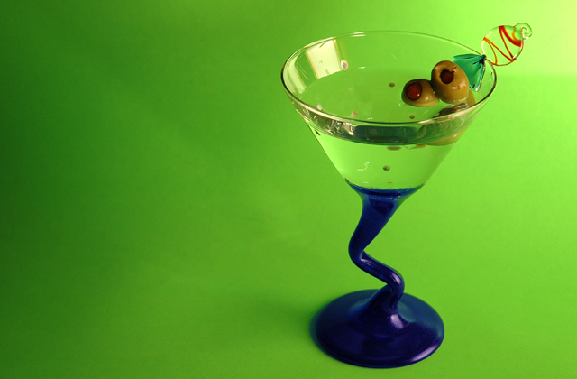
The colors are nice. The green really makes the blue stand out. The glass candy doesn't seem to go with the edgy mood of the rest of the photo, imo. Good control of the reflections.
i LIKE the offset position of this great subject. of course, i take mine with a lemon twist, if you please! lovely entry! (and to be picayune...the glass should be a little frostier.)
(I'm writing this to everyone who submitted a landscape shot) The challenge was to produce a shot worthy of a magazine cover but to me a shot like this is not suitable to be put on a "portrait" format magazine.
Great colours but would have scored even higher if it had been portrait.
---ADDITIONAL---
Due to forum discussions and accusations that marking landscapes down is nitpicking, I'm going through them and remarking. I still think some of the landscapes would not make good covers because of their orientation but I am no longer marking down because of that.
I still think landscape is inapropriate for the majority of magazines but I'll give the benefit of the doubt to the photographers.
Same problem: Magazine covers should be PORTRAIT orientation, not landscape. Have you even seen a magazine that is longer horizontially then it is vertically?? :)
Why did you submit such a good shot in "landscape" format. I would have scored this very highly if you had laid it out as a magazine cover in its correct portrait aspect ratio.
Wow! This is an awesome shot. This is top quality and pitch perfect. I'm going to give you a high mark; however, you may find others will mark you down for having a horizontally cropped image instead of a vertically cropped image. IT seemed to be an issue in the last magazine challenge.






 Add photograph to your favorites
 Add photographer to your favorites


