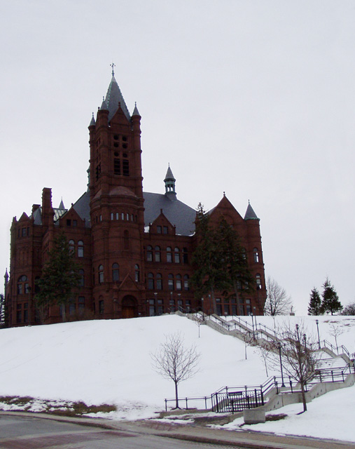
The darkness of the building doesn't do it justice. For an architectural magazine I would expect the shot to highlight & emphasize the beauty of the building. In this shot I'm more drawn to the angles of the steps
Good subject & composition. Better weather would be the key thing to improve here. Outside of that, the best you can do is burn the sky & snow and dodge the building in Photoshop to bring out the details
Converging verticals are a problem here, fortunately this can now be corrected with the new rules as far as I'm aware. The overal shot is almost pretty good, but making all the elements of the building parallel would make it much more professional. Snow is tricky to expose for, and the building is underexposed. IMO the picture would be much better without the road in the foreground. I know that you can use the empty sky to place text and such into for your magazine cover, but as a photo I would have liked some texture in there, for example some clouds. I love the jagged path in this composition.
Too dark. The importance of an architectural magazine is the architecture. Too much foreground. Getting closer to the building and showing more detail would help. There is a little bit of converging vertical lines.
I think this shot would have benefitted from a tighter crop on the building (to elimiinate the street and patch of thawed ground) and rotating it a little to the right so the tower is straight up. It feels off-balance in this composition.




 Add photograph to your favorites
 Add photographer to your favorites


 Photographer found comment helpful.


