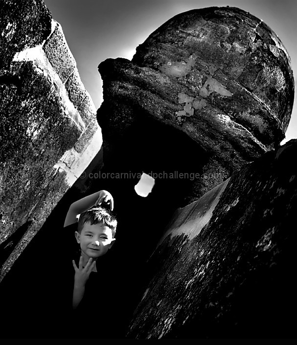
I just wanted to try something a little different with my fave model. I never really got into tilting the camera while taking pictures so I thought I'd try it this time. Turns out the 5 year old decided to tilt his head too lol. (And vogue it as well) The kid tilt, strange sky, extreme contrast, and facial highlight will all look strange to the voters - but it works for me. :) (Hey, my kid could be covered in doo and that would work for me too - as long as someone else cleans him up hehe)
Enjoy!
Statistics
Place: 224 out of 500 Avg (all users): 5.7551 Avg (commenters): 7.6667 Avg (participants): 5.7157 Avg (non-participants): 5.8444 Views since voting: 758 Views during voting: 208 Votes: 147 Comments: 19 Favorites: 0
I really enjoy the body expression on your child. Really adds a nice tension to the tilt. I think the burning is a little dodgy around the builing, hehe, but I think that is a minor point to a wonderful shot.
For me, I loved everything about this shot except the "vogue" part. However, this is such a personal shot that what I think does not really matter. I still gave it a good score because I loved the contrast, the tilt, the lighting on his face. I don't think I would have changed much on this one.
First I have to say that you won me over with your picture of your dog Barney. I love him! I also very much like your entry in this challenge. I'm not sure how to help you with it. The only thing that comes to mind is that it might work better if the line formed by the placement of the child's hands were perfectly verticle. That would seem to anchor the picture against the tilt. Not sure, but I keep thinking that when I look at this otherwise excellent photo. Nice work.
Kudos for trying something different, we should all do that more often. As far as the image goes, i like the texture on the building and the glow of the dome thingy. I like how your model seems to come out of the darkness and how his head is almost vertical with the tilted background. The main thing i dont like is the harsh lighting which is causing a couple of blown out regions (top left of frame and left side of subjects face). I guess there's not a whole lot you can do about those except for shooting at a different time of day, so yeah, with the option you had available,, good job. Hope this helps
K
I think this is so interesting. I love the angle so much. I bet you are AWESOME at doing photo shoots for people with your creative processing and poses!
I agree with the Avg Commenters. This is a really good photo. I love his expression and body gestures, like he is getting ready to move into his presto-karate move.
I like that your trying something different. The kid is cute, the pose works on a young, free spirit, although I think i would have straightened it so his eyes were level. The harsh light on his face really is, IMO, the biggest negative. The only other complaint that i could come up with in the photo is the halo around the dome.
Michelle, this is priceless. The high contrast very much works for me (very much) and the vogue pose is just perfect for this unusual location. Love that little window behind and the fact the dome is kinda glowing. Excellent shot in my book. Can't say I'd change a thing.
Hi Michelle, a critique for you. I actually really like this image, but I think your own comments probably sum up why it didn't score well. I think the tilt works really well. Particularly with his funky pose, it doesn't look odd that he's tilted. The highlight on the face is a big negative. Ideally, he would be shadowed with a diffuser, and maybe a reflector used to bring his face up a little, and maybe some lightening in PS. Ideally, I think he would be closer to the camera. There's a funny line on his collar. Maybe just a black t-shirt would be better. The high contrast editing is too much for me. I often do this, and have to look at it again the next day, and then add some fill-light. The heavy editing look to the sky would also bring the votes down I think. It is a nice effect, but looks unnatural. As another idea, it might be interesting to see this shot in colour, or maybe a selective desat. But overall, I think it's pretty cool. This is definitely worth going back there for a reshoot.
It works because the kid tilted to look like he was vertical. Good choice of black and white (so why's your name colorcarnival?) ;-)
I don't know what the place is, but I imagine it's an old sea fort.






 Add photograph to your favorites
 Add photographer to your favorites

 Photographer found comment helpful.


