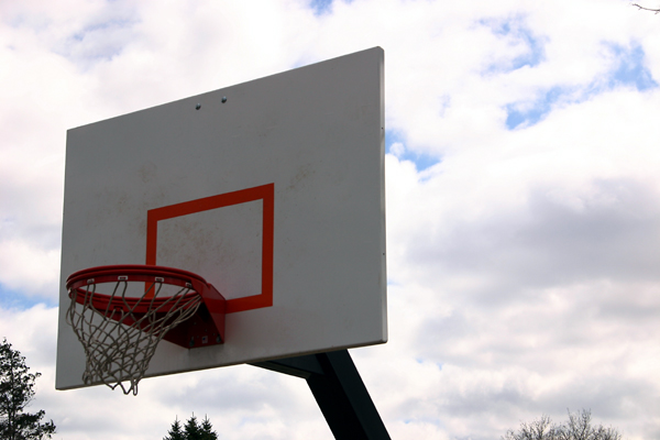
ok that was funny.... WEll here is MO , did you miss the ball?? the back ground is to bright i can't stay focused on the goal. i however like the swoosh in the net.
he he, I thought it was funny as well however it is a 30 month plus shot so was easirr to put down. Jeremy, this realy is a bad image but your more recent shots make it worth while learning the hard way ;)
ok that was funny.... WEll here is MO , did you miss the ball?? the back ground is to bright i can't stay focused on the goal. i however like the swoosh in the net.
Well well, not exactly the best photo in the world! A for effort, F for execution! Too much cropping, needs someone slam dunking, and obviously it needs to be portrait style not landscape! How someone chose this as a favorite is beyond me! lol this was sorta fun.
Though this is a nice capture of a Basketball hoop, it's not the kind of photo that would appear in ESPN magazine - even inside. Now if you had someone in ACTION, like in the midst of a slam dunk, it would be more apropos.
(I'm writing this to everyone who submitted a landscape shot) The challenge was to produce a shot worthy of a magazine cover but to me a shot like this is not suitable to be put on a "portrait" format magazine.
As for the photo itself, its not very exciting, considering the great sporting shots usually seen on magazine covers.
---ADDITIONAL---
Due to forum discussions and accusations that marking landscapes down is nitpicking, I'm going through them and remarking. I still think some of the landscapes would not make good covers because of their orientation but I am no longer marking down because of that.
I still think landscape is inapropriate for the majority of magazines but I'll give the benefit of the doubt to the photographers.
Lighting on this does not help the photo, I think. The subject is too dark and the sky is too bright. A different time of day maybe would help? I prefer to see magazine cover shots in a portrait layout.
Subject and composition appear very "snap shot" with little interest.
The hoop is just a tad too dark, otherwise a good exposure and I like how the wind is moving the net. A lower pov might have been used to get rid of the trees altogether. I don't read sports mags, but this picture might have been more exciting with people in the frame.







 Add photograph to your favorites
 Add photographer to your favorites

 Photographer found comment helpful.


