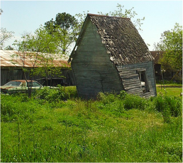
I really like the shot, but it doesn't exemplify the spirit of the magazine it purports to represent nor does it follow the basic vertical format of nearly all magazines published in this country.
(I'm writing this to everyone who submitted a landscape shot) The challenge was to produce a shot worthy of a magazine cover but to me a shot like this is not suitable to be put on a "portrait" format magazine.
---ADDITIONAL---
Due to forum discussions and accusations that marking landscapes down is nitpicking, I'm going through them and remarking. I still think some of the landscapes would not make good covers because of their orientation but I am no longer marking down because of that.
I still think landscape is inapropriate for the majority of magazines but I'll give the benefit of the doubt to the photographers.






 Add photograph to your favorites
 Add photographer to your favorites


 Photographer found comment helpful.


