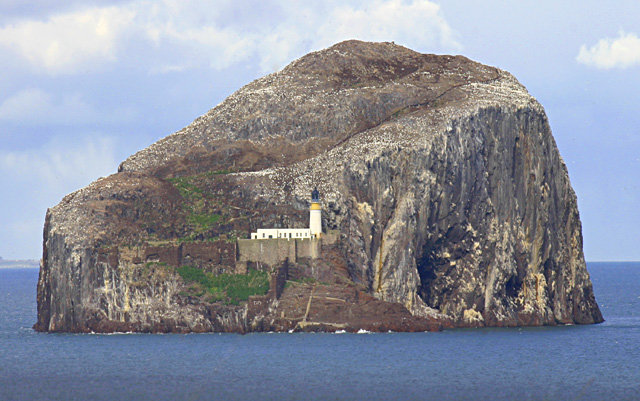
A beautiful photo, but magazines are almost always vertical in format. This shot does have the other requirement-a place where type could go without spoiling it.
Great composition. The island has an interesting shape and a nice variety of textures. It's a bit washed out; a polarizer may have helped when taking the photo, but adjusting levels would improve it some. And some sharpening would bring out the nice textures.
The porportions don'rt work for a magazine cover. Maybe off centering the rock outcropping and sowing more water would help or a tighter shot of the light house.
Seems like the contrast could have been boosted a little more. I like how it is so isolated. Nice Composition, although I wonder what it would look like in different points (the corners are almost identical)/ nice shot
(I'm writing this to everyone who submitted a landscape shot) The challenge was to produce a shot worthy of a magazine cover but to me a shot like this is not suitable to be put on a "portrait" format magazine.
---ADDITIONAL---
Due to forum discussions and accusations that marking landscapes down is nitpicking, I'm going through them and remarking. I still think some of the landscapes would not make good covers because of their orientation but I am no longer marking down because of that.
I still think landscape is inapropriate for the majority of magazines but I'll give the benefit of the doubt to the photographers.
Doesn't look real. What ever you did, was wrong. :) It's tempting to select a certain portion of an image and then go crazy with adjustments, but this a clear example of what NOT to do when fixing your images in PS.
It' s a beautiful subject. The photo itslef looks a bit washed (and I mean I am nitpicking bit, not a noticable bit), likely the result of the distance between you and the island. A little tweeking of the levels may have pulled more out of it.






 Add photograph to your favorites
 Add photographer to your favorites


 Photographer found comment helpful.


