Noise reduction, saturation, slight hue shift in DPP,
Cloned out sensor dust in Photoshop (forgot I could do it in DPP) and added border.
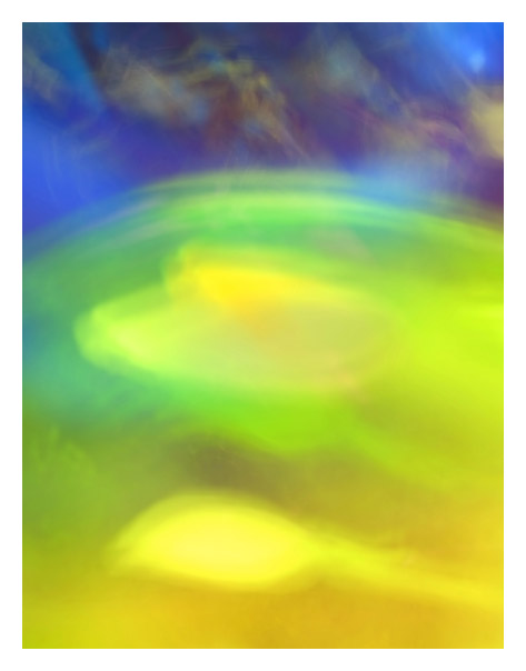
This is my first submission with the new camera. This was taken using a long exposure and movement of some colored glass vases in the sunlight. I had alot of fun doing it. Had several shots I liked.
Statistics
Place: 128 out of 292 Avg (all users): 5.2611 Avg (commenters): 6.7273 Avg (participants): 5.2843 Avg (non-participants): 5.2419 Views since voting: 787 Views during voting: 349 Votes: 226 Comments: 12 Favorites: 0
great choice to go for complimentary colors. Your picture create a good tension between the cheerful yellow/green tones and the dark threatening blues. 10 (back to comment)
The difference between the two colors and the title really work here, the only thing bugging me is the "lines" within the blue part, they mix too much with the bottom.





 Add photograph to your favorites
 Add photographer to your favorites


 Photographer found comment helpful.


