You are not logged in. (
log in
or
register
)
−
Challenge Entries
Pollution
Basic Editing
86th
88th
Portfolio Images
This image is not part of a public portfolio.
Some People just DON"T get IT!
cyclingtmb
Photograph Information
Photographer's Comments
Challenge:
Pollution
(
Basic Editing
)
Camera:
Nikon Coolpix L6
Date:
Mar 10, 2008
Date Uploaded:
Mar 10, 2008
Add photograph to your favorites
Add photographer to your favorites
N/A
Statistics
Place:
87 out of 127
Avg (all users):
5.1037
Avg (commenters):
4.3333
Avg (participants):
5.0000
Avg (non-participants):
5.1302
Views since voting:
1050
Views during voting:
379
Votes:
241
Comments:
8
Favorites:
0
Please
log in
or
register
to add your comments!
Author
Thread
Comments Made During the Challenge
dwainasaurus
Canon EOS-400D Rebel XTi
Tamron SP AF 17-50mm f/2.8 Di II LD Aspherical (IF) for Canon
03/18/2008 11:12:38 PM
Post actions
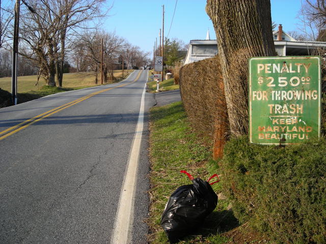
Neat idea but the clutter on the left works against the message.
bobnospum
Sony Alpha a7 V
Sony FE 70-200mm f/2.8 GM OSS II
03/18/2008 10:18:57 PM
Post actions
Maybe cropping it portriat and using the right side would have made it more powerful. The trees and road were not very interesting
rmezzo
Canon EOS-5D Mark II
Tamron SP AF 28-75mm f/2.8 XR Di for Canon
03/14/2008 01:17:40 AM
Post actions
Funny idea. The crop seems a little tight on the bottom and right side.
SkyeMari
Sony DSC-S700
03/13/2008 10:32:58 AM
Post actions
This photograph is very balanced. It seems like the colors are on one side and the gray road is on the other. I also appreciate the irony.
sklokke
Fujifilm FinePix S1000fd
03/12/2008 07:15:45 PM
Post actions
That looks like a very strategically placed bag of garbage.
Stagolee
Kodak Easyshare C180
Canon EF 50mm f1.2 L
03/12/2008 06:28:39 PM
Post actions
Nice prespective and idea for the challenge, well done.
Budya
Canon EOS-5D Mark II
Canon EF 24-105mm f/4.0 L IS
03/12/2008 03:40:34 PM
Post actions
Love the irony here.
BeeCee
Nikon D40
Nikon AF-S DX Zoom Nikkor 18-55mm f/3.5-5.6 ED
03/12/2008 02:15:28 AM
Post actions
The sign looks trashier than the trash. You'd think if they were really concerned with beauty they could at least cover the rust once in a while! :)






 Add photograph to your favorites
 Add photographer to your favorites


