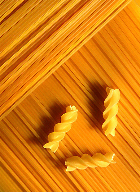
Just came back to see whether you were inspired by the same image as I was, and indeed, I saw the same image of Chris Rout in a book and had my own take on it. (Here //www.dpchallenge.com/image.php?IMAGE_ID=48054 ). The book explained the lighting setup, but contained an error. It showed the light in the same direction of the pasta strands, which kills all the shadows. Great learning.
I think this is a good execution. You have a strong theme of shape and texture working here. The composition in the lower right of '3' is also strong. Odd numbers usually work better :) The opposing diagonals also strengthen the composition without overpowering the focal point in the image.
This also looks like a great composition for magazine cover with plenty of room for a title and supporting text. The overall simplicity of this image also lends itself well to a magazine cover. I'm not experienced in this type of work but this seems like it would make a good cover simply because the image itself is strong and doesn't overpower the other information that may be on the cover with it...
Wow! This really rocks. The contrast of the straigh lines and curves of hte pasta makes for a really effective shot. I can really see this on the cover of a magazine. Good job and good luck. Jacko. 10
Hey... didn't I just see this in Parallel Lines? Yes, it probably would make a decent magazine cover and I do like it. The three small pieces of pasta look out of place to me (another challenge!)- what recipe would call for just 3 bites? Two of them almost form a right angle following the edges of the page- not quite straight, but also not off enough to be random. It would have been cool to see either several types of pasta or a few strands of spinach linguine (or other color).
Another very pleasing pasta picture. However, I don't think it would appear on the cover of a magazine called Easy Home Cooking - such a magazine would probably always have a picture of a something already cooked and ready to serve. I love cooking magazines and always look at them.
Nice except for the shadows. Very creative in my opinion. Althought you should have arranged the 3 items so that the left one was parallel to the grains in the upper left, and then so the other two are perfectly aligned with the right and bottom edges of the image.
Great brown tones and composition. Beautifully done. If you had cloned a few tiny white spots in the middle left of the frame this image would be perfect. One of my favorites for this challenge.
I am afraid people might vote you down because they might think it is me again trying the same thing (see my portfolio), which they really should not do. It was not my idea either, I got my inspiration from a book (gave credit to the photographer) and had to try it as well. I like you composition, it is nice and calm. The light is coming from the right side to create shadows, but I feel it could use some more contrast still. Maybe the light was still to high, not shining flat across the pasta, or another light or reflection softened the shadows. My personal taste is more with strong contrast to make something dynamic out of something static.






 Add photograph to your favorites
 Add photographer to your favorites

 Photographer found comment helpful.


