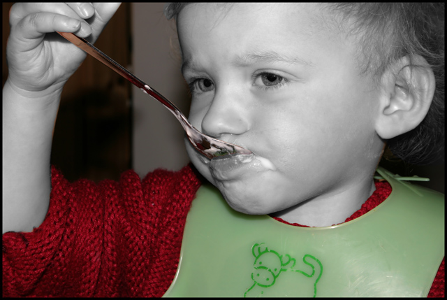
For me the selective desaturation doesn't work here - it seems to draw attention away from the child. I'd rather have desaturated the clothes and left the colour in the face or gone for full black and white.
With different editing this could be a really nice portrait.
I find this kind of picture a bit disconcerting, when the skin tones are in black and white, and everything else in colour. But it is good all the same.
if it was B&W with the red it would be fine, but the Green totally throws it out for me. The design on the bib is distracting. Good focus and an interesting attitude.






 Add photograph to your favorites
 Add photographer to your favorites


 Photographer found comment helpful.


