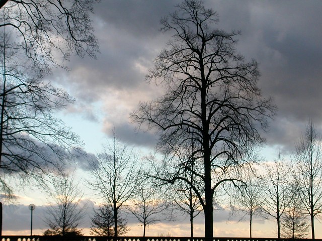
Nice, subtle colors. I like the composition better with the big tree on the left (maybe even the entire left) cropped out. Good job capturing detail in both the bright and dark clouds.
A vertical crop would better suit the magazine cover format. I would take out the partial tree at the left, and you'd have a nice composition of parallels as well as a magazine style photo.
(I'm writing this to everyone who submitted a landscape shot) The challenge was to produce a shot worthy of a magazine cover but to me a shot like this is not suitable to be put on a "portrait" format magazine.
Also the fence at the bottom is distracting.
Nice sky though
---ADDITIONAL---
Due to forum discussions and accusations that marking landscapes down is nitpicking, I'm going through them and remarking. I still think some of the landscapes would not make good covers because of their orientation but I am no longer marking down because of that.
I still think landscape is inapropriate for the majority of magazines but I'll give the benefit of the doubt to the photographers.
Had a quick surf on the net but couldn't find any magazine called "places" Great shot but I'm marking all "landscape" shots a point lower as I don't believe they fit the challenge parameters
Soothing colors and a pretty picture. I don't know about the magazine you are matching it with. This picture doesn't give me a feeling to any particular place. The light(?) on the left breaks the mood of the photo.







 Add photograph to your favorites
 Add photographer to your favorites


 Photographer found comment helpful.


