I really like B&W images. They allow you to see the photo for what the subject IS and not if the colors match or clash or just aren't right. I did a quick search for the pink one but didn't see it.
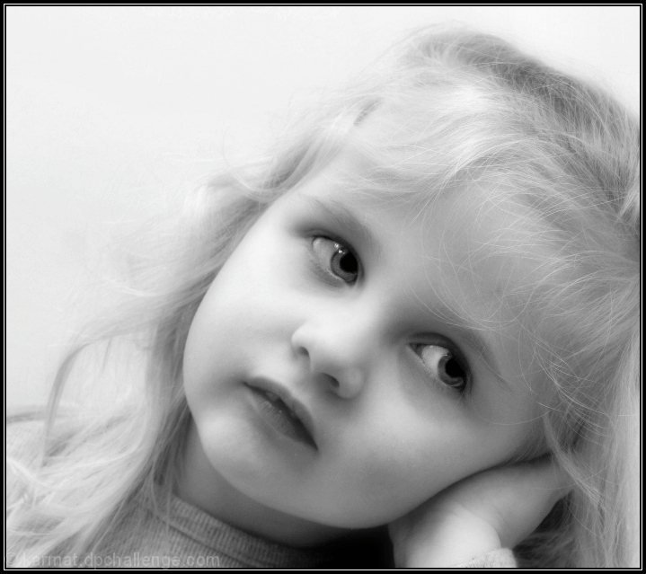
Probably the thing that most popped out at me was the little bit off centeredness. I actually like it! The amount of space to her right (camera left) is equivalent to the amount of her head being cropped. The feeling I get here is you had the camera on a tripod with her sitting in front. You either had a remote or set the timer and when you walked away for a moment she decided to lean her head over on her hand and wait for ..... CLICK! ..... you got her when she wasn't looking!
I know it's completely wrong but that was the first thing that came to mind when I saw this. I am a big fan a sharp/clear images also, so I would've rathered it not be quite so soft. It still should've definitely been a 6+ score. -BB
Very cute girl. I really like the pose and the way her eyes are shifted down and out of the photo. I also like thsat the photo is a little soft, it works well for this type of photo. What doesn't work for me is the high-key look that hides her hair and the fact that the side of her head is cropped off.
I like this very much. From your wonderful letter Kristiana seems to be a bundle of energy, always getting into mischief (am I close?) Which makes this lovely serene calm shot a nice contrast.
The details on the skin are soft, and the lighting on her face is perfect. I like the high key effect, it works very well for me :-)
While I love her expression, I'm a Philistine in that I don't care for the fad of portrait shots that chop off part of the head (usually the top - the top "corner" of her head in your case). If it was widened out just a bit more (at least past her hairline), I might like it better.
Also, as mentioned by surfdabbler, it seems to be not-quite-high-key. That gives it a slightly unfinished feel, which may have been noticed on a gut level.
It's still much nicer than most "professional" portraits.
Oh Karma! I saw this yesterday when I was thumbing thru the photos and thought this was so stunningly beautiful. I don't think I've ever seen a picture of your daughter. She is the PICTURE of "beautiful little girl". Wow!
I love your letter to her too. That is precious, and I can imagine that being precious to her forever.
Beautifully soft and radiant, and perfect for a little girl! (Though I do like the gray - not sure I'd like the pink so much.) Looks a bit like a SandyP portrait. I like the angle of the shot, with her head and face forming the diagonal. I'd like to see just a BIT more sharpness to her eyes but not much - not overly pimped or anything. And I'm glad she likes it in pink. The letter is fantastic, by the way. Good advice, mama!
Lovely shot, and a lovely letter to go with it. :) I'm sure my 4yo daughter would love a pink portrait of herself. There are 2 things that I think let the photo down in the scores. Firstly, the soft focus is great, but needs to be sharpened. Soft focus is a large area softness, and still needs the pixel-size sharpening on top so that soft focus doesn't lean toward blurry. The other thing is the dynamic range. This is a great high-key portrait, but the highs don't quite go to white. Careful tweaking of the levels or curves will improve this image a lot. And white BW is nice, a little bit of pink never goes astray. :)









 Add photograph to your favorites
 Add photographer to your favorites

 Photographer found comment helpful.


